I won’t spend a lot of time explaining that your store has to be convenient for users — that’s kind of obvious, right? Nobody enjoys roaming around a website like they’re trying to find the exit in a parking lot at 2 a.m. But navigation is not just about visitors. Google cares a lot about UX (user experience). If people struggle to find things, leave without buying, or don’t interact with your pages Google notices. And then your rankings can drop just because someone couldn’t find the size filter.
Now, the good news: every store you get from Offiro already comes with built- in tools and structure that support intuitive navigation, smart search, optimized product cards, and mobile responsiveness. And that’s the beauty of buying a ready-to-run business. You don’t have to reinvent the wheel; you just polish it a bit.
In this article, I’ll walk you through the main elements that make online navigation not just “fine,” but effortless. We’ll go through search, breadcrumbs, filters, product cards, and some practical UX tips that will help even if you’re just starting.
1. Website Search

There’s a simple rule I usually stick to: if your store has more than 300 products — you need search. But even if you’re somewhere below that, it’s still an advantage. According to Center Centre, around 25–30% of users actually start their journey with the search bar, not by clicking through categories. That’s a huge number of people who’d rather type than browse.
And here’s the tip: search isn’t just for visitors, It’s for you too.
When customers use your website search (especially if your store has search hints enabled), their route to purchase becomes way shorter. But what’s even more interesting is what you can do with that data.
Most tools, like Google Analytics, will show you:
- How many people use search
- What they type ( and how they actually call things)
- When they hit “search” and then leave
And that’s where things get practical:
- If users searched but didn’t find anything → maybe it’s time to add new products (which you can do in just a few clicks)
- If they found the product but it was out of stock → that’s your warehouse telling you to restock
- If people type one name but the product page uses another → rename it or add synonyms
- If search shows completely irrelevant results → check your backend settings, something’s off
And if users are searching by category names or brands instead of going through your menu, that’s a silent hint your catalogue structure could be more intuitive.
2. Breadcrumb Navigation

Breadcrumbs are basically those little clickable traces at the top of the page that show you where you currently are. They work exactly like breadcrumbs in fairy tales — helping people retrace their steps without getting lost in the woods of your catalogue.
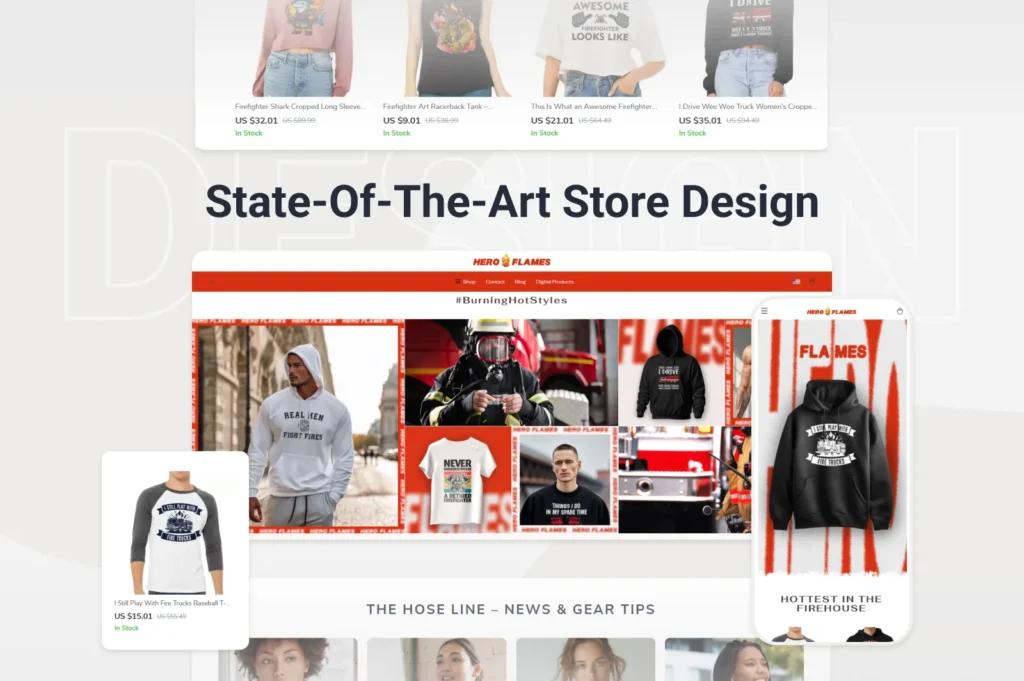
Imagine you run a store selling apparel designed specifically for firefighters and first responders — like Heroflames.com. A user looking at a “Limited Edition Firefighter Hoodie” might see something like:
Home → Professions → Firefighters → Hoodies → Limited Edition
One quick glance and they know where they are and how they got there. And if they suddenly think, “Hmm, maybe I’d rather check the jackets instead,” they can simply click “Firefighters” and go one step back.
A couple of practical tips:
- Make breadcrumbs visible and clickable. Don’t hide them in tiny grey text at the bottom — nobody scrolls to look for directions
- If your store has a deep structure with many layers, consider adding a small drop-down menu into the breadcrumb trail, so users can jump across sections without having to click through every step
Seems like a small detail, but when used right, breadcrumbs help users feel in control. And when people don’t feel lost on your site, they’re much more likely to stay and buy.
3. Catalogue Structure & Human-Friendly URLs

Leaving all your products just floating around in your catalogue is like tossing clothes all over your apartment floor and hoping someone compliments your sense of order. That is why structuring your store is crucial. The tricky part is to figure out how to do it.
Most beginner entrepreneurs go for the obvious setup: Clothes, Accessories, Home & Living, etc. That’s totally fine to start with. But don’t limit yourself only to “what things are.” Sometimes it’s better to structure by how people look for them.
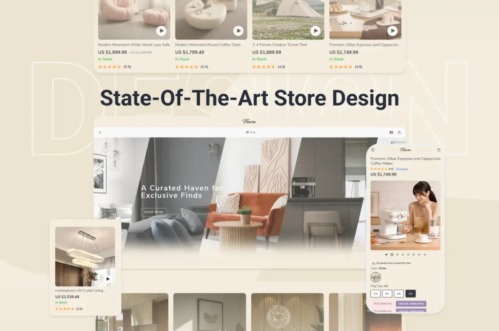
Take Flavra.com, for example. You could search for decor ideas by product type (say, “Table Accents”) but also by style. Someone might know exactly what they want; others are just browsing for inspiration.
Now, let’s talk about URLs. When you add categories or subcategories, you add steps to the URL, like:
/home-decor/scandinavian/vase
Looks clean and logical, right? Each step tells both users and search engines what’s going on. Which is exactly what we want.
But here’s a common beginner mistake: if one product belongs to multiple categories, novices often create duplicates. Please don’t. Let’s say you’re selling leather shoes.
They can easily sit under Summer Shoes, Leather Shoes, and Italian Shoes.
But that doesn’t mean you should create three different product pages. Instead:
- Use canonical tags to indicate the main page
- Or set up redirects to avoid confusion
Because trust me, dealing with duplicated shoes pages in Google Search Console is not the kind of “growth problem” you want.
So to wrap this one up:
- Structure your catalogue for logic, but also for how people actually think
- Use meaningful steps in URLs
- And don’t clone product pages
4. Filters

If structuring your catalogue is step one, setting up filters is step two, and sometimes it’s even more crucial for customer experience. Filters ( or faceted search) help people narrow down your products based on characteristics that actually matter to them. And unless you’re selling a single type of identical spoon, your products do have meaningful differences.
So yes — use filters. Always.
What filters should you use?
Here’s where people often overthink things and start throwing in every single attribute, like “manufacturer region” or “packaging material,” which no one really cares about. Instead, focus on what users actually search for. A few ways to figure that out:
- Search engine data
If someone’s looking for a TV, Google search trends might show that queries include screen size and display type way more often than, say, “smart app compatibility.” So if users care more about 42″ LED than built- in Netflix, follow their lead. - Competitor analysis
Check how competitors handle filters. If their filtering structure is logical and clean, there’s no shame in borrowing it. Or improving it (that’s where you can outperform them). - Customer feedback
If multiple customers ask, “Hey, can I filter only red items?” — well that’s a hint.
But before adding filters, make sure your products have complete and consistent data. Nothing more annoying than selecting a filter that shows half your inventory. Also, convert values properly (cm vs inches, ml vs oz, etc.). You don’t want your store to look like it’s switching between Europe and the US mid-page.
Static pages from popular combinations
Filters typically generate dynamic URLs, and some CMS platforms let those pages get indexed by search engines. Sounds good, right? Not really. It often leads to duplicates and we’ve already decided that this isn’t good.
But here’s what you can do:
- Identify a few high-demand filter combinations (e.g., “Summer Dresses → Linen → White”)
- And then create static pages for them manually.
This makes those pages SEO-friendly, and Google tends to rank them surprisingly fast. Just don’t create static pages for every possible combination — only the ones truly worth it.
5. Product Sorting

Once your catalogue section has more than 10 products, just listing them randomly won’t work. That’s where sorting comes in — it helps users decide how they want to browse, based on what matters most to them.
Here are the sorting options you should consider:
- Price – Classic choice. Some visitors look for the cheapest option (budget shoppers), while others might go “show me the premium stuff first.” Both are valid.
- Discount – If someone’s bargain-hunting, make sure the biggest deals come first.
- Date added – Great for returning customers who check what’s new. If they liked your store once, chances are they’ll want to stay updated.
- Popularity – Sort by the most purchased or most viewed items. A quick way of saying, “Other people love this — maybe you will too.”
- Rating – Show products with higher average review scores at the top. But don’t hide items without reviews: some customers prefer “brand new, not yet judged” over something with mixed feedback.
It’s often smart to allow users to switch sorting type and direction (ascending/descending) — for example, “Price: low to high” or “high to low.”
And a quick but important note:
6. Product Cards in the Catalogue

Here’s the thing: the more products you’ve got in a category, the more annoying it becomes for users to open new tabs just to compare stuff. So the goal here is simple:
What must be on the product card:
- Product name — no surprises here
- Brand — some buyers filter by brand mentally even before the actual filtering
- Picture — ideally a clean, high-quality image. No weird angles, no cluttered backgrounds
- Price + discount (if any) — if you offer sale pricing, show both the original and discounted price clearly
- Availability — nothing kills enthusiasm faster than clicking into a product that’s “temporarily unavailable”
- Rating — just a quick visual ( like ★4.7/5). Helps people build trust instantly.
And that’s pretty much it. No need to display technical specs, long text, or customer reviews right here. That’s what the product page is for.
If your store supports it, add a hover feature — when someone points their cursor at a product card, they can see a bit more info ( like a short description, available colors, maybe even a quick “Add to cart” button). It makes browsing smoother and encourages impulse clicks.
7. Product Page

The proper structure of a product page deserves its own separate article ( and we’ll probably write that one soon). There are just too many nuances when it comes to design, trust triggers, content hierarchy, and conversion psychology.
But since we’re focusing on navigation, I’ll highlight what matters most right here.
1. Guide the user toward the main action
The primary goal of any product page is simple: convince the customer to buy.
So make sure:
- Main buttons ( like “Buy” or “Add to cart”) stand out clearly
Use different colors than secondary actions like “Compare” or “Add to wishlist” - Use clear wording
“Buy now” or “Add to cart” works better than vague “Next” or “Continue” - Give visual feedback
When someone adds a product to their cart, confirm it. A little pop- up or notification goes a long way
Users shouldn’t be guessing what will happen if they click. Clarity equals confidence. Confidence equals conversion.
2. If it doesn’t convert — redirect
Not every product page will seal the deal and that’s totally fine. Your next mission is to guide them to something that will convert.
Useful blocks to include:
- “Similar products” – Alternatives in case this one wasn’t right
- “People also buy” – Social proof plus extra upsell opportunities
- “Complete the look” / “Pair with” – Complementary items often lead to bigger orders. Think: shoes + matching bag, camera + tripod, etc.
3. Don’t forget about “Recently viewed”
Someone might browse a few items, get distracted, leave and then come back five minutes later thinking, “What was that item I liked?” If they have to search for it again, chances are you’ve lost them.
A “Recently viewed” block solves that. It’s a small addition that often recovers lost conversions.
In short: the product page is your closer. If it can’t close, it should at least re-route. Make actions obvious, alternatives accessible, and going back effortless.
8. Discounts, Bestsellers & New Arrivals

These sections are great for pointing customers toward products that are cheaper, more popular, or freshly added. And trust me, many users go straight for them without even checking the full catalogue. Some people just love a bargain, others want what’s trending, and some are curious about “what’s new.”
Boost visibility even further
You can ( and should) reinforce these sections with special filters, such as:
- “Discounted items”
- “Popular choice” or “Bestsellers”
- “New in store”
It’s another way to direct attention immediately without needing to browse category by category.
These sections subtly guide decision-making before customers even know what they’re looking for. A small change that often has a big impact.
Practical UX Tips to Improve Navigation & Overall Experience

Let’s wrap things up with some hands- on advice. Below are simple, practical improvements that I genuinely believe even beginner entrepreneurs can apply without diving too deep into design theory.
1. Consider both mobile & desktop (separately)
Navigation works very differently depending on the device. Mobile users rely on scrolling and finger taps, while desktop users prefer hovering, wider views, and minimal clicking. Here’s just one example: drop-down menus.
- On mobile, where screen space is limited, and you want to compact things, they work great
- On desktop, overly layered drop-downs can be irritating: they add extra clicks and hide options that could’ve been visible at once
So instead of designing “one site fits all,” treat mobile and desktop as two user experiences that share the same brand, but not the same layout logic. Ideally, your structure, CTAs, banners, and even filter placement can differ slightly depending on the device.
2. Don’t fight user habits
Your store may look unique, but basic navigation shouldn’t be experimental.
People expect:
- Logo → homepage
- Cart icon → top-right
- Filters → left or above product list
- Product image → front and center
Ignore these patterns, and you’ll get “ Where is…?” instead of “Add to cart.” Be unique in presentation, not in usability.
3. Think about scalability early
Today you may have 80 products, tomorrow — 150, and hopefully 500 someday. Structure your categories, filters, menus, and product card logic so they can grow without becoming chaotic. Think forward even if it feels premature.
4. Don’t overdo creativity
Creativity helps your brand stand out, but if users struggle to find the “Buy” button because it’s blended into a gradient nebula background (true story), that’s a problem. Personality is welcome, confusion is not.
5. Make buttons easy to see and understand
Your main action buttons should:
- Use contrasting colors
- Be large enough to tap or click comfortably
- Say exactly what they do (e.g., “Buy now”, not “Go” or “Continue”)
If someone must think before clicking, they likely won’t.
6. Keep catalogue design clean and consistent
Use similar formats for product photos, pricing layouts, icons, and card shapes across your entire store. Inconsistency makes users feel something’s “off,” even if they can’t explain why. Consistency equals trust.
7. Don’t skip the “About” page
Especially for small businesses, this page is often underestimated. People are more inclined to buy when they feel like they know who’s behind the store. You don’t need a life story — even a short, sincere paragraph (“We started because…”) adds credibility.
Final thought

UX exists to make things easier. Every click you save, every second you shorten the decision-making process, improves conversion chances.
And if you’re working with an Offiro store, you already have a serious head start:
The catalogue structure is professionally designed, so even if you’re not experienced in UX, you’re not starting from zero. You already have a clean, scalable base.
Mobile optimization is built in, which means your store is designed to work with modern browsing habits.
Filters, sorting options, and product cards come pre-configured, based on eCommerce best practices. You can adjust them to match your niche, but the hard part is already done.
You get access to data-based insights (especially during the trial period). You can act based on real customer behavior.
You’re not doing this alone. Offiro offers expert support and marketing services, so if you’re not sure how to improve UX, or you want someone to take a deeper look—you’ve got professionals who do this every day.
And finally — speed. You don’t need to spend months fixing technical UX errors. With Offiro, you get a fully working store from day one, meaning you can focus on optimizing, testing, and selling, not setting things up from scratch.
Explore Offiro today and see how easily your entrepreneurial journey can begin.